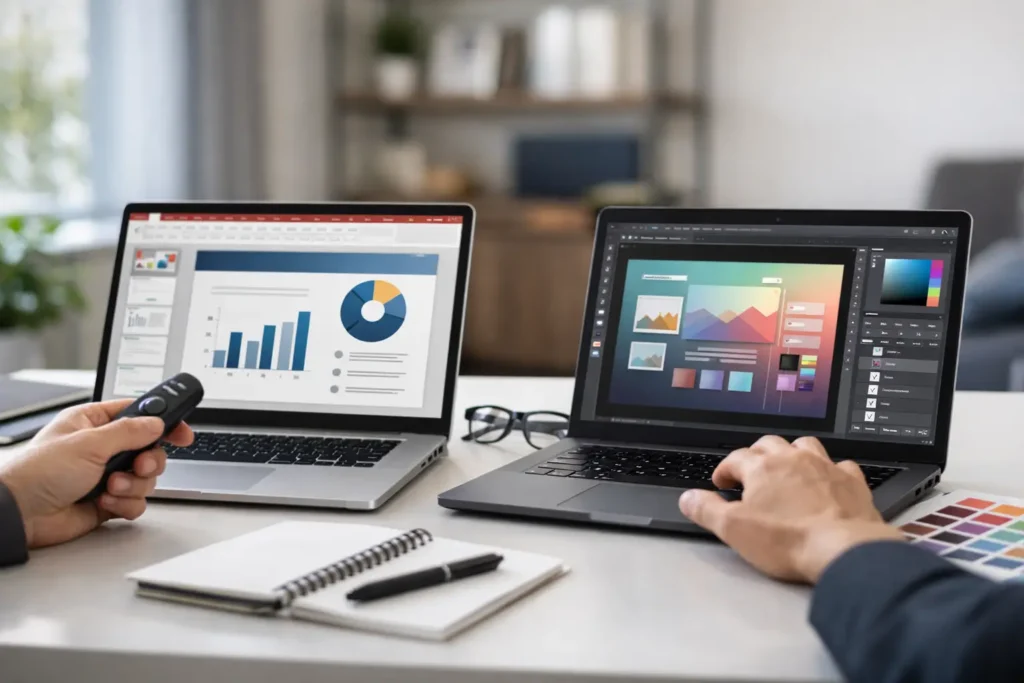
A company picnic notice should not require a design request, three review rounds, and a week of back-and-forth. Yet that is often what happens when the people responsible for employee communications are forced to work in tools built primarily for professional designers. The PowerPoint workflow vs design tools decision is not really about which application makes the prettiest slide. It is about who can create timely messages, how those messages stay on brand, and whether employees actually see them.
For internal communications teams, HR, operations, and IT, the right workflow needs to handle the ordinary messages that keep an organization aligned: a sales milestone, a benefits deadline, a safety reminder, a leadership update, a new-hire welcome, or a company picnic. These messages need speed, consistency, and accountable delivery. Design quality matters, but it cannot come at the expense of communication momentum.
Why the Workflow Matters More Than the Canvas
Most organizations already have a familiar creation tool in place: PowerPoint. Employees know how to add a headline, apply a branded layout, use a photo, and update a number. That familiarity is not a minor convenience. It removes the adoption barrier that slows internal communication programs.
Specialized design tools can offer polished templates, advanced image editing, and tightly controlled visual systems. They are a strong choice when a campaign needs custom illustration, complex brand work, or a high-production marketing asset. But internal communication is a different operating environment. The content changes frequently, the audience is broad, and the person publishing may be an HR manager at 4:30 p.m., not a designer with an open production queue.
The practical question is simple: can the person who owns the message create it, get the right approval, and publish it while the message is still relevant?
PowerPoint Workflow vs Design Tools for Internal Communications
A PowerPoint-based workflow puts content creation close to the people who understand the update. A regional operations lead can update a KPI slide. HR can turn a benefits reminder into a visual notice. A department manager can recognize a team achievement using an approved template. Communications still sets the standard, but it does not become the bottleneck for every small change.
This model works especially well when PowerPoint templates are built with guardrails. Locked logo placement, approved fonts, set color choices, and reusable slide layouts give non-designers a safe operating lane. Instead of starting with a blank canvas, they start with a communication format that already reflects the company brand.
Design tools generally offer a different kind of control. They can make it easier for a design team to build a highly refined asset library and enforce visual standards within that environment. The trade-off is that a new tool may require licenses, training, permissions, asset management, and a handoff process. If contributors cannot use the tool confidently, the work returns to a central creative team. Requests pile up. Small messages get delayed or downgraded to email.
Neither approach is automatically right. A design-led workflow is appropriate when creative differentiation is central to the result. A PowerPoint workflow is usually the more effective choice when employees across the organization need to publish frequent, branded operational updates without waiting on a specialist.
Speed Is a Communications Requirement
A message about an upcoming town hall has a short window of value. So does an announcement about a system outage, a deadline for open enrollment, or a shift in priorities. If employees receive the information after the moment has passed, the visual quality of the message will not recover its usefulness.
PowerPoint supports fast iteration because the edit is familiar. A communicator can duplicate a proven slide, change the title, replace the image, revise a date, and send it for approval. Teams can also build recurring formats for monthly metrics, employee recognition, quarterly goals, and event notices. Over time, content creation becomes a repeatable process rather than a new design project every time.
That does not mean every slide should look identical. It means the organization decides where consistency is valuable. A recognition message can feel celebratory. A security alert can be direct. A leadership update can use a more formal layout. Templates create structure while leaving enough room for the message to fit the moment.
Governance Without a Creative Traffic Jam
Centralized governance is often misunderstood as centralized production. They are not the same thing.
Governance means the organization controls who can publish, which templates are approved, where messages appear, and how long they remain active. Production means someone has to make every individual asset. When those two responsibilities are tied together, communications teams can become a service desk for minor edits.
A stronger model separates them. The central team establishes templates, brand rules, review practices, and publishing permissions. Departmental contributors create content within that system. IT retains control over endpoint deployment and access. This gives the organization both consistency and responsiveness.
For example, communications may provide an approved slide set for a big sale announcement, a product beta update, a goals celebration, and a company picnic. Local teams can personalize the dates, names, and calls to action without changing the visual foundation. The result is relevant communication that still looks like it came from one company.
The Real Gap: Creating Is Not Publishing
The biggest limitation of both PowerPoint and standalone design tools is that neither one is, by itself, an internal communications channel. Creating a message is only the first step. Employees still need to see it.
Email is easy to send but easy to miss. Chat messages are immediate but disappear into active channels. Intranets require employees to remember to visit. A desktop communication channel changes the equation by placing approved content on screens employees already use, including login screens, wallpapers, screensavers, video playback, and push notifications.
This is where a PowerPoint workflow becomes operationally useful. A communicator creates content in a familiar format, then publishes it through a centralized platform to the right employee groups. A company-wide leadership message can reach everyone. A location-specific safety notice can reach one site. A team recognition message can reach only the people it celebrates.
ConnectedCompany is designed around this practical sequence: create in PowerPoint, share from a central control panel, and communicate through managed employee screens. The workflow preserves familiar content creation while adding the governance and delivery that internal communications teams need.
Measure the Message, Not Just the Effort
A polished slide has no business value if nobody sees it. Internal communication programs need more than evidence that content was created and posted. They need visibility into reach and engagement.
When desktop messages are managed centrally, communicators can see whether content was displayed and whether notifications were read. That changes the conversation with leadership. Instead of saying, “We sent the update,” the team can discuss which messages reached employees, which audiences need a follow-up, and whether a time-sensitive announcement received attention.
Measurement also improves future content. If a concise KPI slide receives more views than a dense paragraph, that is useful information. If an event reminder performs better when it appears on the login screen and is supported by a notification, the team can repeat that pattern. Analytics should guide practical decisions, not create reporting for its own sake.
When Design Tools Are the Better Choice
There are cases where a dedicated design workflow earns its place. A major employer-brand campaign, annual report, executive video series, or visual identity refresh may require the skill and precision of professional design work. Use the right tool for that level of creative demand.
The mistake is applying the same production standard to every internal update. A deadline reminder does not need a full creative brief. It needs to be clear, correct, on brand, and visible before the deadline. Treating routine communication like a campaign increases cost and delays action.
A practical organization often uses both approaches. Design teams create the visual system and high-impact campaign assets. Communications, HR, and operations use approved PowerPoint templates to keep daily information moving. The key is making the handoff intentional rather than letting tools dictate the process.
Choose the Workflow That Keeps Work Moving
Before selecting a workflow, ask four operational questions:
- Can non-designers create an approved message without extensive training?
- Can the organization control brand standards, permissions, and audience targeting?
- Can a time-sensitive update move from draft to employee screen quickly?
- Can communicators verify that employees had an opportunity to see it?
If the answer to any of these is no, the issue is bigger than design capability. It is a communication system gap.
Employees do not need more places to look for information. They need timely messages in a channel they naturally see, created by the people closest to the work and governed by the teams responsible for the brand. Build the workflow around that reality, and everyday updates can do more than inform. They can unite, inspire, and help people achieve the next goal together.